
What’s the easiest way to increase time-on-site, decrease bounce, and make it more likely people share your content? Readability.
Readability: “The ease with which a reader can understand written text”
Great content is irrelevant if it’s a pain to read. Most people who have a website rarely consider the typography used on their website – from font family to size, line-height, color, contrast, and more.
Think of a website that’s a pleasure to read. For many, they’ll think of Medium. And that wasn’t by happenstance – it was a deliberate action towards readability.
And did you know that the big tech companies have all created their own fonts in order to make it easier for people to read large amounts of content? Google has the quirky Literata. Amazon has Bookerly. Microsoft has over half a dozen.
Why the interest? By the time you’re 40, only half the light gets to your retina as it does when you’re 20. And by the time you’re 60? It drops down to 20% (presbyopia). Nearly 9% of Americans are visually impaired.
Readability is not just important – it is critical for your online business.
My goal here is to break down the seven variables that will help make your site a pleasure to read. And at the end will be a downloadable PDF that sums it all up.
It should be noted that the seven variables I cover are setup as guidelines. I always recommend going with a professional designer who can fully appreciate the nuance behind intelligent design and user experience.
1. Font Family (aka serif vs sans-serif)
You may have heard of serif vs sans-serif, but what’s the difference?
The easiest way to explain is that serif fonts have a flourish around the edges of letters, whereas sans-serif (sans literally translates to “without”) do not.
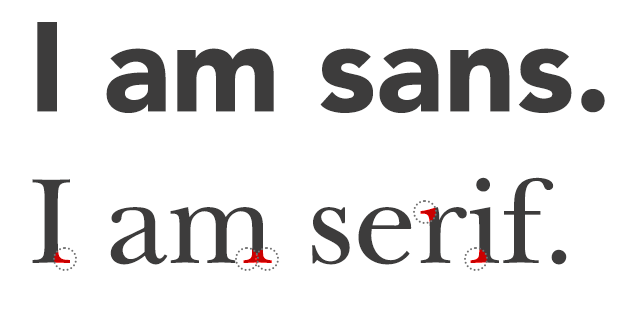
People associate serif with printed word (think newspapers), and thus with a bit more trust. Sans-serif fonts are usually described as more modern, and were heavily utilized by websites when the Internet first started going.
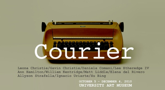
Fonts are powerful. People have emotional responses to fonts! The New York Times found that the font Baskerville caused a 1.5% increase in people feeling safe, and Typographie noted how fonts can affect mood positively! Courier reminds people of a typewriter and Helvetica reminds people of the US Government.
Studies of sans-serif vs serif are very interesting. In general, people actually score higher on reading speed and comprehension with sans-serif fonts, but subjectively, they prefer serif fonts (Psychophysics of Reading).
The reason sans-serif was more popular online was because monitors had low DPI (dots per inch). In order to keep the letters clean (and thus easier to read) for a serif font (due to the edges), the DPI of the screen had to be higher. It was not until the past 5-10 years when companies have vastly upped the resolution of their screens (think Apple and their high res screens) that serif fonts have made a comeback.
In fact, when Smashing Magazine looked at 50 popular websites, they found that many of them have transitioned away from sans-serif to serif fonts.
Serif is subjectively considered easier to read (and more trusted), whereas sans-serif is considered more modern.
2. Font Size
The #1 complaint when it comes to websites? Font size is too small (Nielson).
In general, the recommendation is to have a font-size of 16px, which translates into 12pt on a printed document.
The Psychographics of Reading found that everyone read better (both speed and comprehension) with larger font sizes. Further research corroborates this again and again.
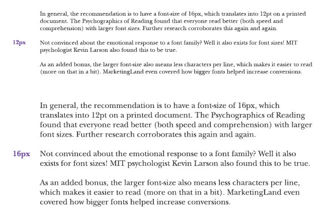
Not convinced about the emotional response to a font family? Well it also exists for font sizes! MIT psychologist Kevin Larson also found this to be true.
As an added bonus, the larger font-size also means less characters per line, which makes it easier to read (more on that in a bit). MarketingLand even covered how bigger fonts helped increase conversions.
Go for a minimum of 16px for font-size
3. Line Height
The line height (called “leading” in typography) refers to the amount of space between two lines of text. For example, double-spacing is a line-height of 200%.
The line-height has to hit a sweet spot – if it’s too low, it’s hard to discern each line. If it’s too big, it’s harder to jump to the next line. In general, 150% is the recommended value.
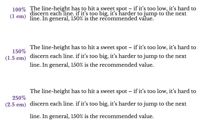
Think of adequate line-height as letting your text breathe.
Go for a line-height of 150% (1.5em)
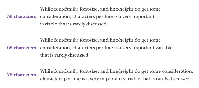
4. Characters per Line
While font-family, font-size, and line-height do get some consideration, characters per line is a very important variable that is rarely discussed.
There’s a reason why newspapers used columns – it’s easier to read.
Too long a line, and it’s harder to jump to the next line (a 2004 study from the University of Reading confirmed this). Too short, and it breaks the rhythm of reading.
The recommended characters per line is roughly 55-75 characters. Go for 65 as a simple target. You can even use something like FlowType.JS to automatically resize to fit your target characters per line.
An easy way to do this is to use a side-menu that forces the content to be narrower in width (it’s what we do at SJO.com). You can also increase font-size to decrease the number of characters per line.
Go for roughly 55-75 characters per line
5. Contrast
Along with small text, poor contrast is the other top complaint for websites (there’s even an advocacy site decrying poor contrast).
The contrast of your text (color of text on top of background color) is important in order to make it easy for your end-user to keep reading your content.
Similar colors will just give your users a headache – opt for dark text on a light background (and don’t forget how many people have their mobile devices at a lower light).
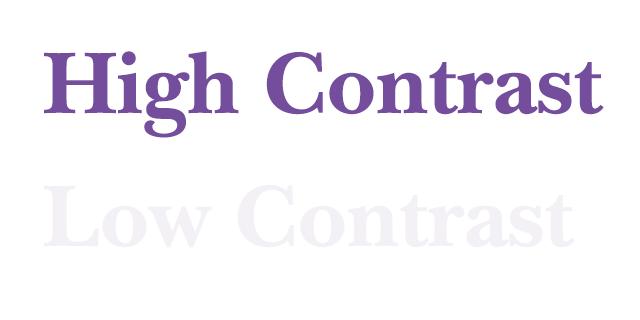
On that note, do not go for pure black (#000000) on white. That contrast can be a bit too harsh – use a slightly soft grey (think #111111) on the white background (or black on a slightly grey background).
Do not go with the opposite – white text on black. It’s simply too tiring to read on a monitor. And if you really want to dig into it, here’s a great post by Tom Osborne on color contrast.
Go for very dark text on light background.
6. Headlines
Headlines are the first thing a user reads, and they help segue the user into the text they are about to read.
A common technique to make headlines stand out even more is to use a different font from the text. Even simpler, if you are using a serif font for the body of your text, go with a sans-serif font for the headline.
Another general rule is to have the headline 2.5x to the size of your text (for those keeping score, it’s equivalent to two lines of text + the line-height between them)
Do not go for all capitals – they are harder to read.
Remember – the headlines are meant to have gravity – your eyes naturally gravitate towards them. Don’t have them in an awkward location or away from the text – once a user reads the headline, have them segue into the content beneath the headline.
Go for a different font for the headlines, and have the headline be 2.5x the size of your text.
7. Don’t forget Phones & Tablets
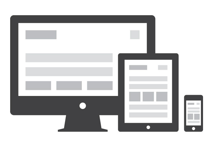
Don’t forget – your content has to be readable on a variety of devices – mobile phone, tablet, and desktop.
While the above recommendations are for the desktop, they can be adopted for mobile phones and tablets:
- Ensure the font is readable (mobile phones and tablets tend to have a higher DPI than monitors)
- Decrease characters per line to roughly 35-50 characters
- Increase line height to 1.75-2x (easier to read due to the scrolling nature).
If you want to get advanced, look into fluid typography with viewport units.
And make sure you load up and view your website on both a phone and a tablet.
Go for a responsive design that makes your content easy to consume on mobile.
Other Notes of Interest
Most people perceive underlined text to be a link. Don’t underline non-links.
All caps are not easy to read, but an interesting technique is to use a drop cap for your content.
Legendary advertiser David Ogivly said “The drop capital increases readership of your body copy by 13%” and Maria Veloso stated that implementing a drop cap on one website contributed to a 251% increase in sales.
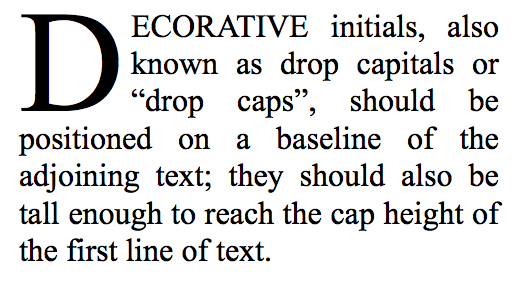
Adobe’s dropcap.js makes it easy to add to your site. Or you can do it via CSS too.
Have the first paragraph’s text size be even bigger. This makes it even easier for the person to segue from the headline to the copy.

Smashing Magazine brilliantly not only has the first paragraph text bigger, but they stick the ad right at the top. This forces the column to a bit narrower at the beginning… which decreases the characters per line (in an organic manner), and it makes it easier for someone to start reading!
Microsoft Research found that our attention span has gone from 12 seconds in 2000 to 8s in 2015. The lesson here – always make it easy for someone to read your content!
Best Practices for Content
Before wrapping up, I do also want to focus on best practices for content.
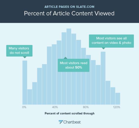
The reality is, no matter how amazing your content is and how on-point your readability is, people will scan. Only 25% of your traffic will read everything. The average person will just spend enough time on your website to read 20% of your content, and people can’t stay focused past the 50% mark. The more you write, the more people just stop reading.
Does this mean you should write shorter content?
No way. Moz found that in-depth content gets more links. And here’s a summary by Buzzsumo on how longer content generates the most traffic.
So what are some general rules to follow when writing headlines?
- Have good subheadings (<h2> and <h3>) in your content. Making them eye-catching helps the user segue into your content
- Make your content scannable
- Use bold and italics (but never underlines)
- Use lists (like this!)
- Use <blockquotes> to highlight
- Keep to shorter paragraphs – it makes the user feel like they are reading it faster
- Do not use jargon – that limits your potential audience greatly
- Be concise – you’re not writing a novel
- Use images – people retain more information visually. To maximize shares, use animated or hand-drawn images.
- Quotes can also be useful – people love sharing quotes
- Make it easy to share – if it was interesting and a pleasure to read, they’ll want to share it
My buddy Kris has a nice article summing up over a dozen ways you can make your content easy to scan (and this guy was getting hundreds of thousands of visitors to his sites, so he gets it).
Wrap up
One can say that webdesign is 95% typography. And a great designer will know how typography plays into the overall experience.
When it comes to low-hanging fruit to improve your website, readability is at the top of that list.
Many companies have learned the benefits of improving readability – increased time-on-site, decreased bounce rates, and more shares. All with no downside.
Enter your email in below to get a one-page summary on best practices for readability and content (easy to share with your team or just focus yourself) and a list of HTML elements to consider for readability when designing.
BONUS: It’s not ready, but in the next few weeks I’ll be releasing a simple readability tool to help you improve your own site’s readability – letting you test out the 7 variables I’ve covered. Make sure you enter your email below to be notified when it comes out.
Want to make sure people read your content?
Pop in your email address and I’ll send you an easy-to-follow checklist on what to do.
Leave a Reply